
16 Best Color Theory Books
The best color theory books, ranked by how many expert sources recommend each one, with notes to help artists and designers find a useful starting point.
Our take
Color theory books can teach you to mix paint, build palettes, notice visual relationships, or understand the histories behind particular hues. Those goals overlap, but they call for different kinds of books. A collection of palettes offers quick inspiration, while a workshop asks you to learn by making studies. Books about perception can also challenge the idea that a color has one fixed appearance.
For a guided introduction, try Color by Betty Edwards or David Hornung's Color. Interaction of Color explores how neighboring colors change what you see. Painters working from observation may prefer Color and Light, while designers choosing combinations can browse A Dictionary Of Color Combinations or The Designer's Dictionary of Color. The Secret Lives of Color provides cultural background rather than studio instruction. Start with the kind of work you want to make, then put the book beside your materials and test its ideas in small studies.
16 books · 8 sources · Last updated
As an Amazon Associate, we earn from qualifying purchases (at no extra cost to you).
How to choose from this list
Skip to the full rankingIf you're new to color mixing: Color by Betty Edwards → Color Choices
If you want a structured studio course: Color → Interaction of Color
If you paint realistic scenes: Color and Light
If you want palette inspiration for design: A Dictionary Of Color Combinations → The Designer's Dictionary of Color
If you work in watercolor: Making Color Sing
If you're curious about color's history: The Secret Lives of Color → Color Problems
The 16 books, ranked
Ranked by how many expert sources name each book. Ties go to the book more people recommend.

Interaction of Color
For artists and designers who want to test how colors change in relation to one another. Its perceptual experiments reward active looking rather than memorizing rules, though it is less useful as a step-by-step paint-mixing manual.
What it's about
Josef Albers explores how colors influence one another and alter visual perception. Color studies demonstrate relativity, intensity, temperature, boundaries, and illusions of transparency, offering artists and students an experimental approach to understanding color relationships.

Secret Language of Color
Science, Nature, History, Culture, Beauty of Red, Orange, Yellow, Green, Blue, & Violet
For readers curious about color beyond the studio, including science, nature, and culture. The broad illustrated approach offers context missing from exercise books, though it is not a focused course in mixing pigments or designing palettes.
What it's about
Joann and Arielle Eckstut explore color through science, nature, history, and culture. Photographs and graphics accompany explanations of perception, physics, chemistry, and individual hues, revealing the varied roles color plays in natural and human-made environments.

For students and self-directed learners who want assignments rather than inspiration alone. The workshop structure connects theory with repeated experiments across disciplines, though it asks for sustained making and reflection rather than passive browsing.
What it's about
David Hornung connects color theory with practice through structured assignments and discussions. Examples from painting, textiles, graphic design, illustration, and animation support an exploration of color, with digital techniques included alongside hands-on exercises.

For painters who want a clearer system for mixing and building harmonious schemes. Its emphasis on a working color wheel gives choices an organizing framework, though paint-centered instruction transfers less directly to digital production requirements.
What it's about
Stephen Quiller uses his color wheel to explain relationships, mixing, and structured color schemes. Step-by-step guidance explores underlays, overlays, and individual color choices, encouraging artists working in different painting media to develop a personal sense of color.

For beginners who want a course they can follow with materials in hand. The exercises connect observation with mixing more directly than a palette reference, though the lessons require practice rather than a quick read.
What it's about
Betty Edwards turns color theory into a practical course for artists and designers. Exercises explain how to observe and combine hues, understand the effects of light, adjust value and intensity, and create harmonious relationships in paintings and everyday surroundings.

Color Theory
An Essential Guide to Color - From Basic Principles to Practical Applications
For oil and acrylic painters who want a short introduction to practical color decisions. The focus on value, temperature, and mixtures keeps the lessons close to painting, though advanced readers may find the coverage introductory.
What it's about
Patti Mollica introduces color theory for oil and acrylic painting through explanations, examples, and practical projects. Topics include hue, saturation, value, temperature, pigments, mixing, and color relationships, showing how choices can support composition and visual expression.

A Dictionary Of Color Combinations
For designers who need a visual starting point for choosing palettes. Ready-made combinations make it easy to compare relationships at a glance, though the book offers much less explanation of why a choice works in a particular project.
What it's about
This collection presents 348 color combinations developed by Japanese artist and designer Sanzo Wada. Drawn from his work of the 1930s, the palettes bring together traditional and Western influences, offering a visual reference for exploring relationships between colors.

For representational painters and illustrators who want color connected with observed light. Its examples help explain the appearance of real scenes, though readers focused on abstract palettes or graphic design may need a different starting point.
What it's about
James Gurney connects artistic observation with explanations of color and light for realist painters. Illustrated discussions examine how illumination reveals form, how pigments behave, and how atmospheric effects influence a scene, helping artists translate visual experience into painting.
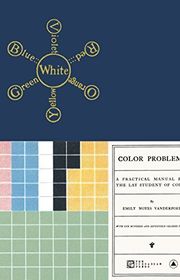
Color Problems: A Practical Manual for the Lay Student of Color
For designers and artists interested in historical ways of analyzing palettes and visual objects. Its charts offer a different kind of inspiration from modern exercises, though the scientific explanations belong to an earlier period and need historical context.
What it's about
Emily Noyes Vanderpoel combines explanations of color with illustrated studies of objects, textiles, and other visual arrangements. Color charts and analytical plates document an early approach to observing proportion, relationships, and harmony within existing designs.

For artists who understand the basics but hesitate when choosing combinations. Activities and varied examples support experimentation with harmony and contrast, though the range of options is less sequential than a tightly structured introductory course.
What it's about
Nita Leland explores harmony, contrast, and unity through color activities, demonstrations, and work by contemporary artists. Charts and practical tools help readers experiment with combinations, apply design principles, and develop color choices that support individual expression.

For painters who learn by keeping charts, journals, and records of mixtures. Its exercises turn color exploration into a repeatable studio habit, though the workshop approach requires materials and time rather than offering instant palette answers.
What it's about
Nita Leland teaches color mixing, palette selection, and expressive schemes through exercises and step-by-step demonstrations. Examples from contributing artists and suggestions for color journals, charts, and reference tools encourage experimentation and a more deliberate use of color.

For watercolorists who want color choices connected with shape, value, and composition. Practical lessons encourage deliberate experimentation within a painting, though the examples and handling of transparent color are less directly relevant to opaque or digital media.
What it's about
Jeanne Dobie offers practical lessons on color and composition, with a focus on watercolor. Exercises explore complementary hues, warm and cool relationships, shapes, and values, encouraging artists to experiment with arrangements that make paintings more visually engaging.
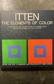
The Elements of Color: A Treatise on the Color System of Johannes Itten Based on His Book the Art of Color
For readers who want a compact introduction to Itten's influential system of contrasts and color relationships. The condensed treatment makes his framework more approachable than the larger original, though it reflects an artistic teaching system rather than current color science.
What it's about
This condensed presentation of Johannes Itten's color teaching examines contrasts, relationships, and harmony through explanations and visual examples. Edited by Faber Birren, it adapts material from The Art of Color into a shorter reference for students and artists.

The Secret Lives of Color
For readers who enjoy the stories behind pigments, shade names, and cultural associations. Short histories make it easy to read in pieces, though this is background and inspiration rather than a practical color-theory course.
What it's about
Kassia St. Clair tells the histories of colors through stories linking pigments and hues with art, fashion, politics, and war. The collection reveals how familiar shades acquired their names, meanings, and cultural associations.

Color Lab for Mixed-Media Artists
52 Exercises for Exploring Color Concepts through Paint, Collage, Paper, and More
For artists who want to explore color through varied materials instead of a single painting medium. Short projects encourage regular experimentation, though the mixed-media breadth provides less sustained depth on one technique than a specialist painting book.
What it's about
Deborah Forman presents fifty-two exercises that explore color through painting, collage, drawing, and other mixed-media practices. Projects connect nature, history, psychology, and expression with practical instruction on selecting, mixing, and pairing colors.

The Designer's Dictionary of Color
For graphic designers who want examples and cultural context organized around individual colors. The dictionary format makes selective browsing easier than following a studio course, though historical associations are prompts to consider rather than universal meanings.
What it's about
Sean Adams explores individual colors through design examples, palette variations, historical uses, and cultural associations. Organized by the spectrum, the book connects color choices with applications in graphic design, art, and everyday visual culture.
Sources
- 1
Best Color Theory Books For Artists
conceptartempire.com
- 2
11 Best Color Theory Books for Artists Everywhere
homesthetics.net
- 3
9 Essential Color Theory Books for Designers and Artists
zekagraphic.com
- 4
10 essential color theory books for graphic designers and artists
linearity.io
- 5
Color and Color Theory: Theory & Treatises
libguides.nypl.org
- 6
20 Books on Color and Design
designersandbooks.com
- 7
Color Theory Books
goodreads.com
- 8
What are good resources for learning color theory?
reddit.com





Edited by
Software engineer whose passion for tracking book recommendations from podcasts inspired the creation of MRB.
Lead investor at 3one4 Capital whose startup expertise and love for books helped shape MRB and its growth.
Comments
Spotted a missing book, a wrong order or a mistake? Tell us and we'll fix this page.
We're a reading guide, not the author or publisher, so we can't send books or pass on messages.